8. Visualization
Visualizations help us to understand and interpret data. Typically, matplotlib is used for this purpose. However, the pandas library also provides basic functionalities to create plots which can be further adjusted using matplotlib.
Hint
If you want to create a new visualization or if you are looking for some specific elements, such as titles or colorbars, it is always a good option to use examples: https://matplotlib.org/stable/gallery/index
8.1. OEE graph
Todo
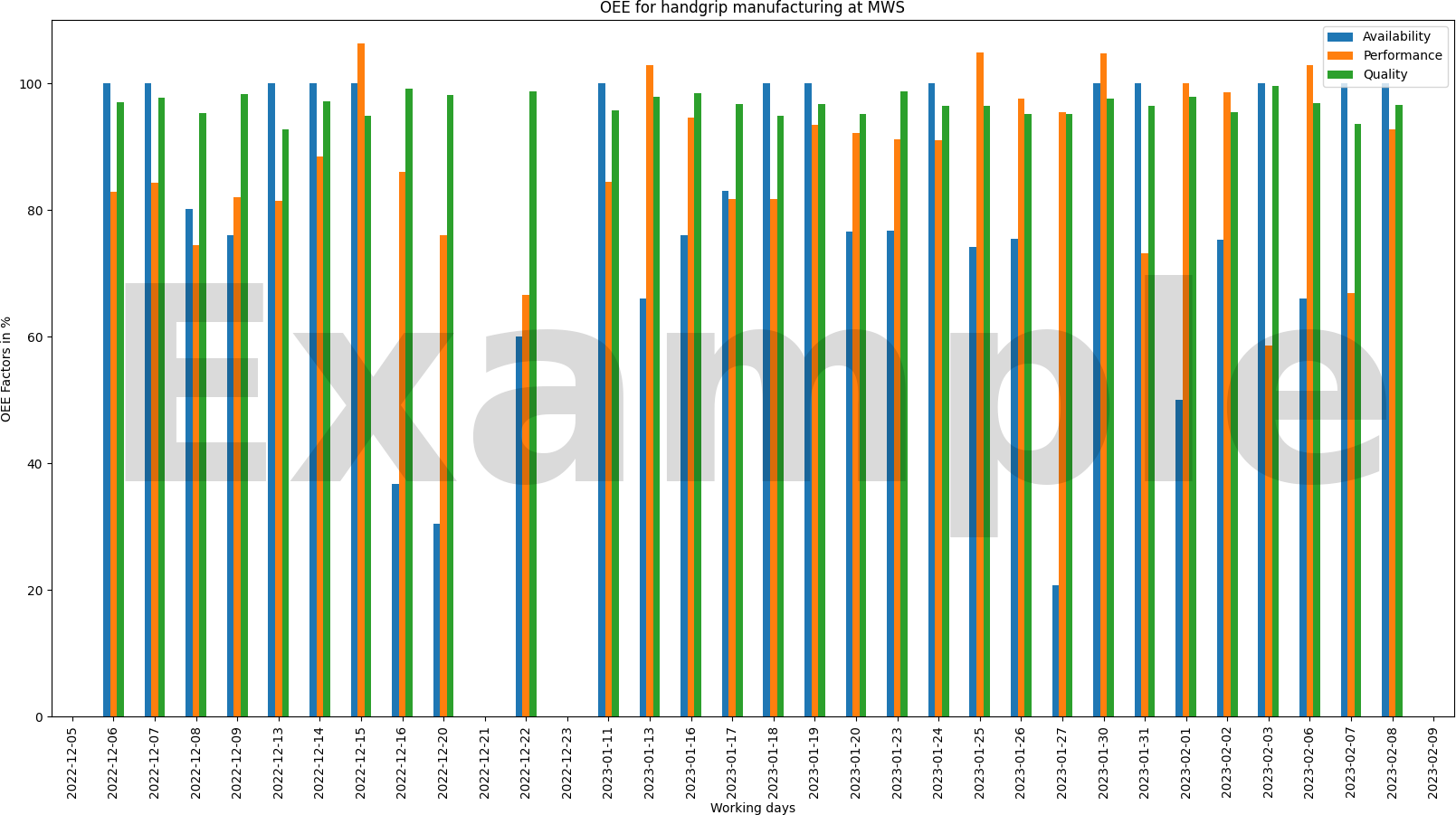
Implement the function draw_oee() to create an OEE bar chart displaying the OEE parameters per day.
Include a heading, axis labels, and a legend.
Show the parameters in % and adjust the figure size according to your data.
Save the figure as png-file in the folder figures.

8.2. Scatter plot - cycle times
Todo
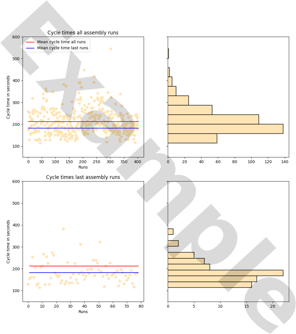
Implement the function draw_scatter to create one scatter plot for all cycle times (each point should represent one run) and one scatter plot for the cycle times of the last run. Add a histogram to both scatter plots.
Also, add a line plot for the average cycle times to both scatter plots.
Save the figure as png-file.
Do not forget to label your axes and include a heading.

9. Data evaluation
Now you have a good basis to understand your data and start improvement processes.
Todo
What would you do to improve the OEE?
Todo
What do you see as main factors which negatively influence the OEE?